If you have used the Mail app in Windows 10, you know this email client is very minimalistic. It consists of three main areas referred to as panes: The left column is the Folder Pane, the middle column is the Inbox Pane, and the Reading Pane in the right column. The Mail app does offer an option not often found in many email clients—personalization. While it might have a minimalist workspace, the personalization option of the Mail app is a simple way to modify the interface of the app to suit your personal preferences.
To get started personalizing the Mail app follow these quick steps:
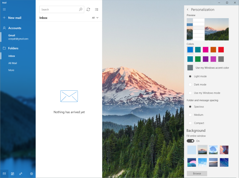
The Mail app has four areas which can be personalized in step 3: Colors, Mode, Folders and Messaging Spacing, and Background. (See Figure 1.)

Figure 1. Mail app showing the Personalization options
Mail provides, by default, ten colors you can choose from to personalize the app. You can also select the "Use My Windows Accent Color" option. This results in the Mail app using whatever color you have selected as your Windows color (covered under another tip).
Mail offers three mode options that alter the overall appearance of the app. No matter which option you choose, the Reading Pane will always use a white background and dark text.
The Folders and Messaging Spacing section provides three options: Spacious, Medium, and Compact. These options determine the amount of spacing between items in the Folder and Inbox panes.
Mail, by default, has an image as the background of the app. This is a characteristic not normally found in email clients. When you are personalizing Mail the background section offers a few options to help customize the look and feel of the app.
Once you have the Mail app personalized the way you want it, you will discover that this minimalist app offers a pleasant user experience. You may also find that it becomes your default email app.
![]() This tip (1192) applies to Windows 10.
This tip (1192) applies to Windows 10.
Memories are an important part of our lives. Keeping track of those memories is important, too. The Photos app within ...
Discover MoreAs you go through the day or work on a project, you may find it helpful to write thoughts or inspirations down and have ...
Discover MoreYour local meteorologist has access to some handy weather maps. With Windows 10 and the Weather app, you have access to ...
Discover More2023-03-20 09:47:31
J. Woolley
@Sondie Frus
I don't use the Windows Mail app, but in Outlook click File > Options > Mail > Replies and forwards > When replying to (forwarding) a message: Include original message text.
2023-03-19 14:31:38
Sondie Frus
My email only shows what I write, not the email I am responding to. How do I change that? I want my receiver to see the context for my comments. I'm using Comcast as my server and Windows 10 on my computer. I can't even find the right terminology to look for the answer.
Thanks ever so much.
2021-11-01 11:31:23
Eric Jay Toll
The Windows Mail App has amazing potential, especially for people with multiple email accounts, they can be linked and all display at one time.
In the Windows 10 version of the Mail app, it's even possible to create signatures using graphics and different fonts, font colors, bold, italic and other formatting features.
In Windows 11, all of those personalized enhancements are gone, so signatures look like they come from an iPhone and have no individuality. Blah! Another example of Microsoft taking a perfectly good product and downgrading it.
Microsoft To-do has been tweaked and is much better than before, and the Calendar is also updated nicely, but there is no sense of using either if you want to send or reply with professional-appearing or personalized email.
Copyright © 2026 Sharon Parq Associates, Inc.
Comments